






How to use AI to Upscale a Low-Resolution Logo for Large-Format Display Printing

Your display design is approved. The size is set. The event date is on the calendar. Then someone asks for the original logo file, and the only version anyone can find is a small PNG pulled from the company website five years ago.
Can you still print it? Sometimes.
AI upscaling tools can improve low-resolution artwork enough for large-format printing in some cases, but they can’t fix every file, and they don’t replace a true vector logo. This guide explains when upscaling works, how to test it properly, and how to tell whether the result is good enough to print.
Table of Contents
ToggleCan You Upscale a Low-Resolution Logo for Large-Format Printing?
Yes, in some cases. A low-resolution raster logo can sometimes be enlarged with an AI upscaler and still look good in a large-format print, especially when the display will be viewed from a distance. But upscaling doesn’t turn a raster image into a vector file. It adds pixel information that helps the image look better at a larger size.
Whether it works depends on a few things:
- Quality of the original file
- Amount of compression it’s already been through
- Complexity of the logo (fine detail vs. simple shapes)
- Finished print dimensions
- Expected viewing distance
- Which upscaling method is used
- Whether the process changes any important brand details
Because so much depends on these factors, the first step isn’t opening an upscaler. It’s figuring out what the finished display actually needs. For the fuller picture on getting artwork print-ready in general, including vector vs. raster formats and resolution basics, see our guide to top-tier art files.
Why Low-Resolution Artwork Causes Problems in Large-Format Printing
Most of the low-resolution files we see come from a handful of predictable places: a logo pulled from a website, an email signature, a screenshot, a social media profile, an image copied from a PDF, or a phone photo of an existing sign.
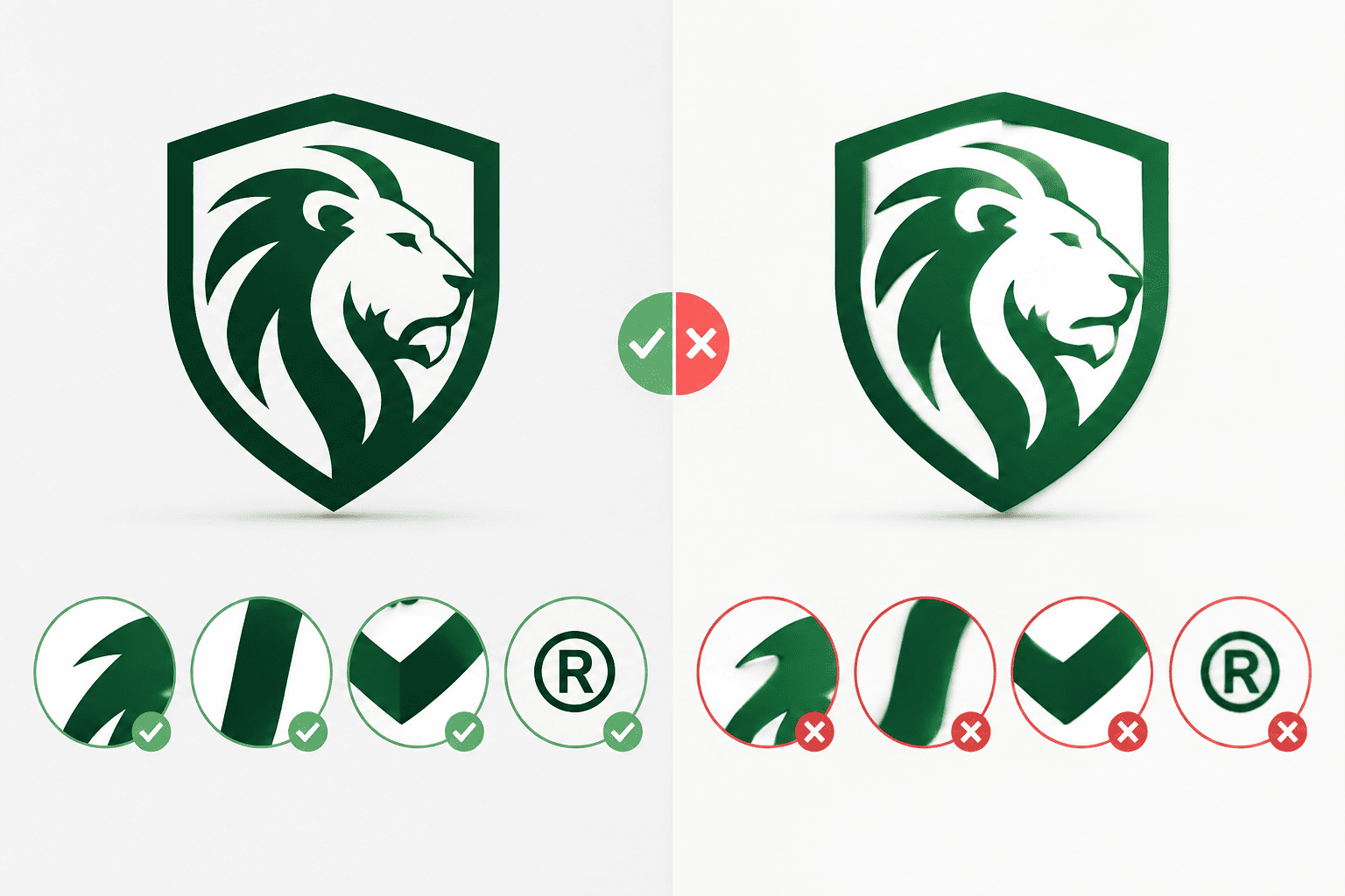
These files often look fine on a screen. Printing them several feet wide is a different story. Enlarging an image doesn’t add missing detail; it just spreads the same pixels across more space. That’s when you start seeing jagged edges, blurry lettering, pixelation, compression artifacts, and soft or distorted details.
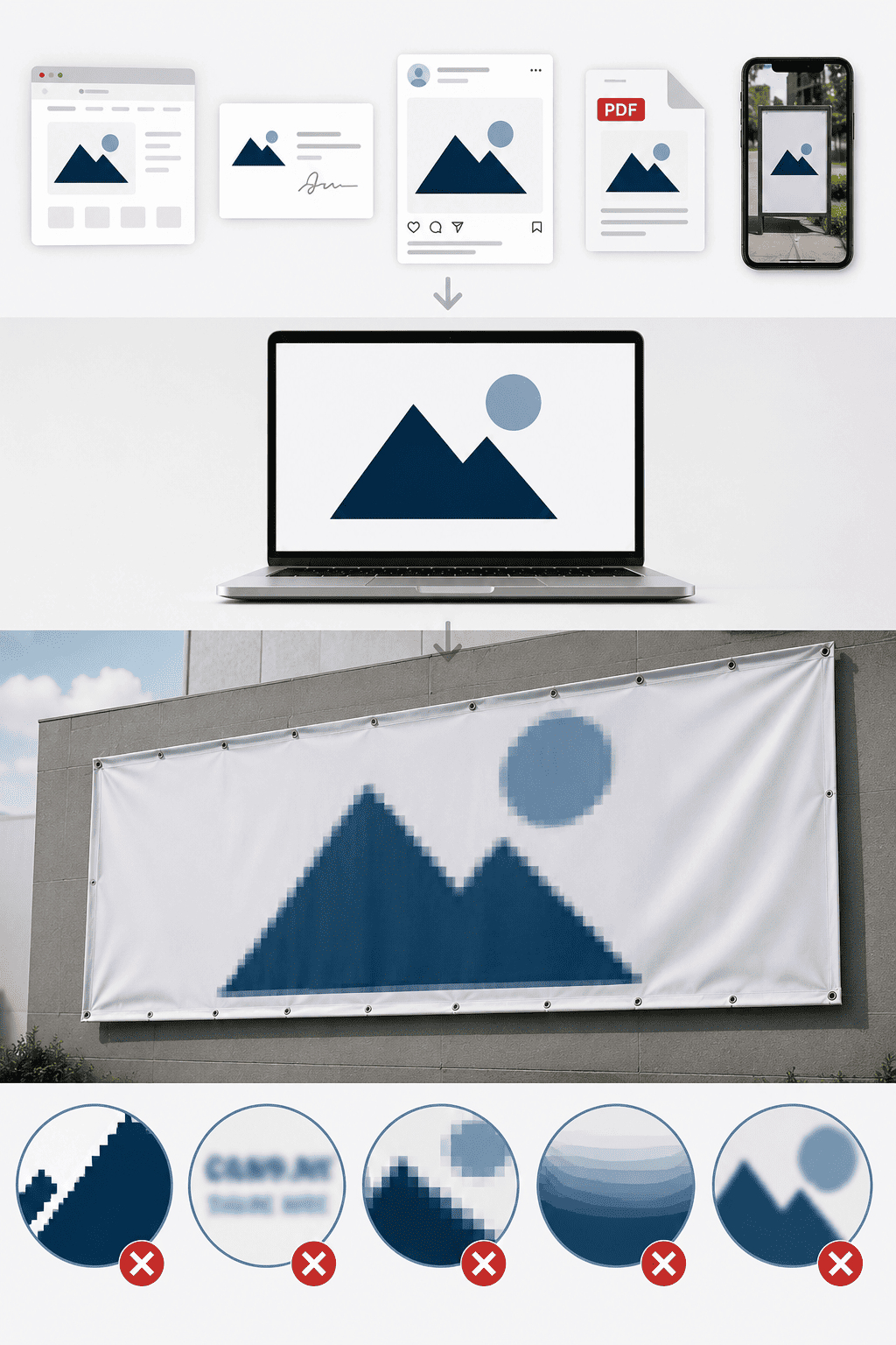
Before trying to fix a low-res file, look for the original. If a vector version exists (an AI, EPS, or vector PDF file), use it. Vector artwork can be scaled without the resolution limits of a raster PNG or JPEG. Before reaching for an upscaler, check with the designer who created the logo, your branding or ad agency, whoever built your website, a previous print vendor, or your internal marketing team. One email could save you from reconstructing a weaker file from scratch.
Learn more about preparing files for print in our Artwork Guidelines.
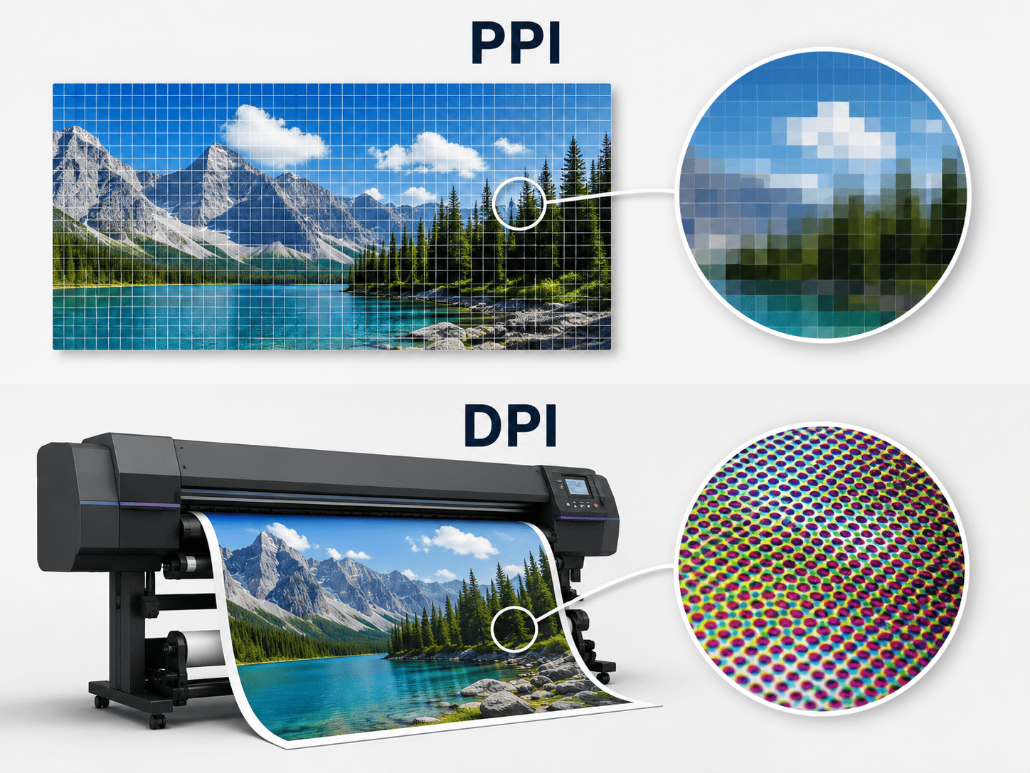
PPI vs. DPI: How Much Resolution Does Large-Format Printing Actually Need?
Before deciding whether an image needs upscaling, it helps to separate two terms that often get confused:
- PPI (pixels per inch) describes your digital image: how many pixels are available for each inch of the finished artwork.
- DPI (dots per inch) describes printer output: the physical dots a printer lays down.
When you’re checking whether a logo has enough image data for a given print size, PPI is the number that matters.
Viewing distance changes the answer.
This is where large-format printing differs from something like a brochure. A tabletop display might be viewed from just a few feet away. A feather flag outside a dealership may be seen from considerably farther away. A building banner could be viewed from across a parking lot. The farther the viewer stands, the less fine detail their eye needs to resolve.
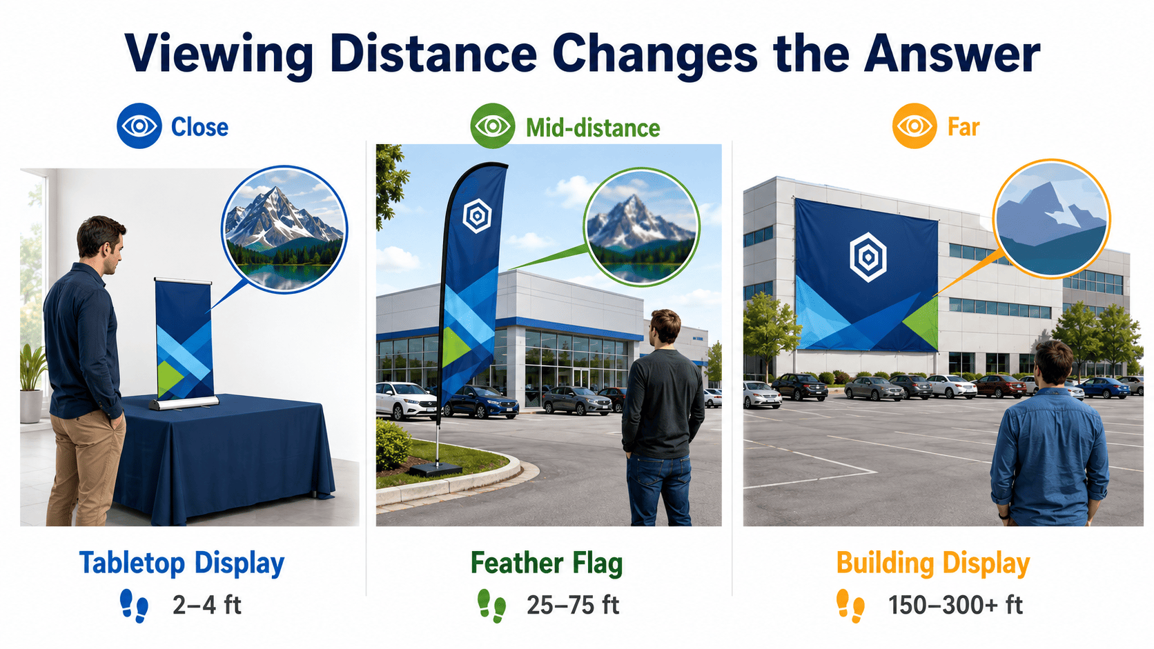
So the real question isn’t “Is this image high resolution?” It’s “Does this image have enough resolution for this finished size, at this viewing distance?”
Lush Banners recommends submitting artwork with images at an absolute minimum of 150 PPI. Requirements can vary by product, so always check the specs for what you’re ordering. See our Artwork Guidelines for current file preparation requirements.
How to Calculate Effective PPI
You don’t need special software for a basic estimate. Divide the pixel width of your image by the finished width in inches:
Pixel width ÷ finished width (inches) = effective PPI
For example, an image that’s 4,800 pixels wide, printed at 48 inches wide, comes out to:
4,800 ÷ 48 = 100 PPI
That number tells you more than the raw pixel dimensions alone. In this example, 100 PPI falls below our 150 PPI minimum, and even a file that meets the minimum isn’t automatically production-ready. The finished product and viewing conditions still matter.
A good workflow looks like this:
- Determine the finished dimensions.
- Check the product’s artwork requirements.
- Calculate the effective PPI at finished size.
- Consider the expected viewing distance.
- Decide whether the original artwork is sufficient.
- Only then, test whether upscaling is worth it.
In other words: figure out the print requirement before you upscale, not after.
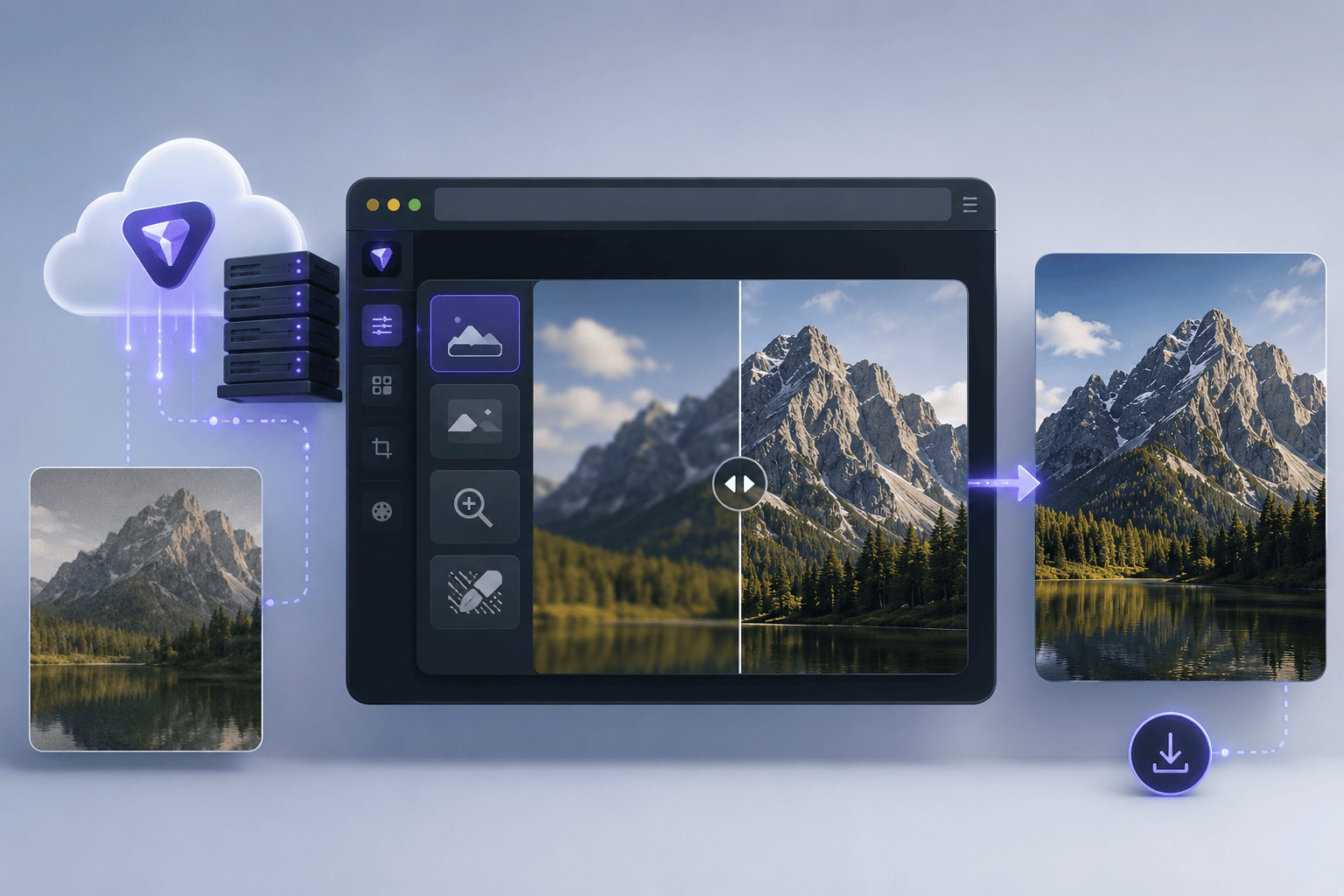
What Is Topaz Image Web?
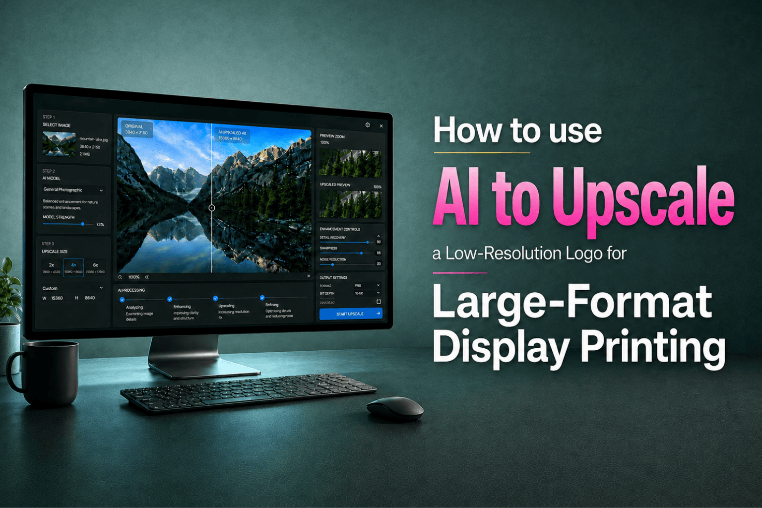
Topaz Image Web is a browser-based tool for enhancing and upscaling images. Because processing happens remotely rather than on your own computer, it doesn’t require high-powered graphics hardware to use.
One thing to keep in mind: some file formats get converted during processing, so check the downloaded file before dropping it into your final layout.
Topaz organizes its browser tool around different “workflows,” each built for a different kind of image problem. For logos and other brand-critical artwork, choosing the right one matters.
Standard Upscale vs. Creative Upscale: Which Should You Use for a Logo?
This is probably the most important decision in the whole process.
Standard Upscale is built to increase resolution while staying faithful to the original image. That’s exactly what you want for a logo. The company’s logo should still be the company’s logo when it’s done.
Creative Upscale works differently. It uses generative processing that can introduce new detail or reinterpret parts of an image. That can be a good fit for creative or AI-generated imagery, but it’s not the right tool for a corporate logo. If the process alters a letterform, a trademark symbol, the curve of an icon, or a color boundary, the result might look sharper while actually being less accurate.
Our recommendation: Start with Standard Upscale for logos or any identity-critical artwork. Preserving the source matters more than making the image look more “detailed.”
Step by Step: How to Upscale a Low-Resolution Logo in Topaz Image Web
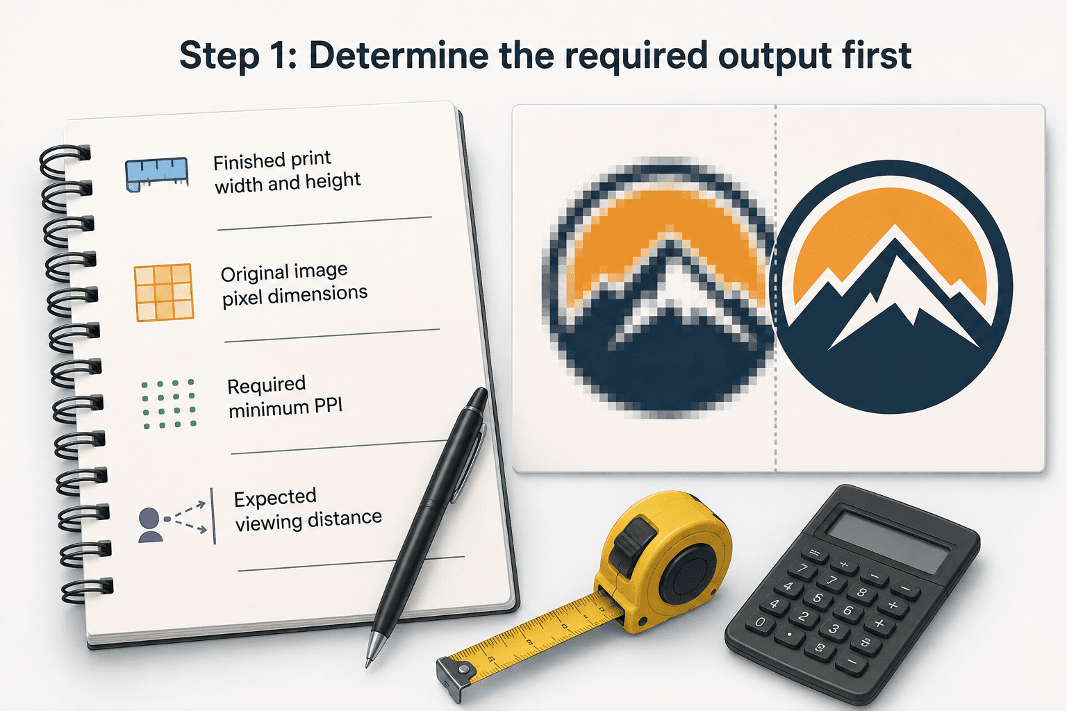
1. Determine the required output first
Before uploading anything, note the finished print width and height, the original image’s pixel dimensions, the required minimum PPI, and the expected viewing distance. Now you know what you’re working toward.
2. Choose Standard Upscale:
For branded artwork, start with the fidelity-focused workflow rather than a generative one.
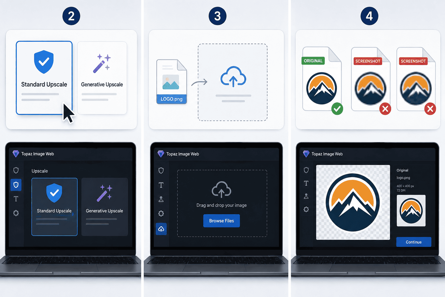
3. Upload the best original file you have:
Avoid extra conversions. Don’t take a screenshot of a JPEG and then upscale the screenshot. Every unnecessary step degrades the source further.
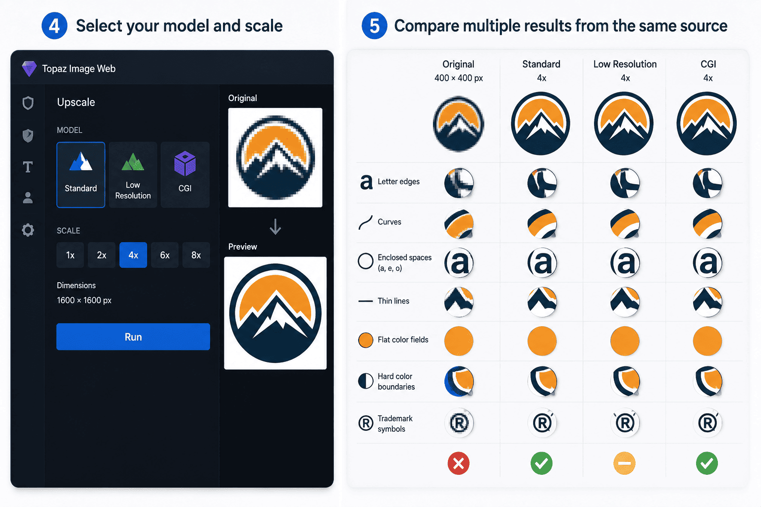
4. Select a model and scale:
For a small, flat-color logo, that usually means comparing Standard, Low Resolution, and CGI. Choose your scale based on the pixel dimensions you actually need, not the largest multiplier available.
5. Compare results from the same source:
Don’t judge a model in isolation. Run the same file through a few candidates and compare letter edges, curves, enclosed spaces in letters like “a,” “e,” and “o,” thin lines, flat color fields, hard color boundaries, and trademark symbols.
6. Use a side-by-side comparison view:
A before-and-after slider is especially useful for lettering, since you’re comparing the same shapes in the same position. Look for improvement, but also look for changes that shouldn’t be there.
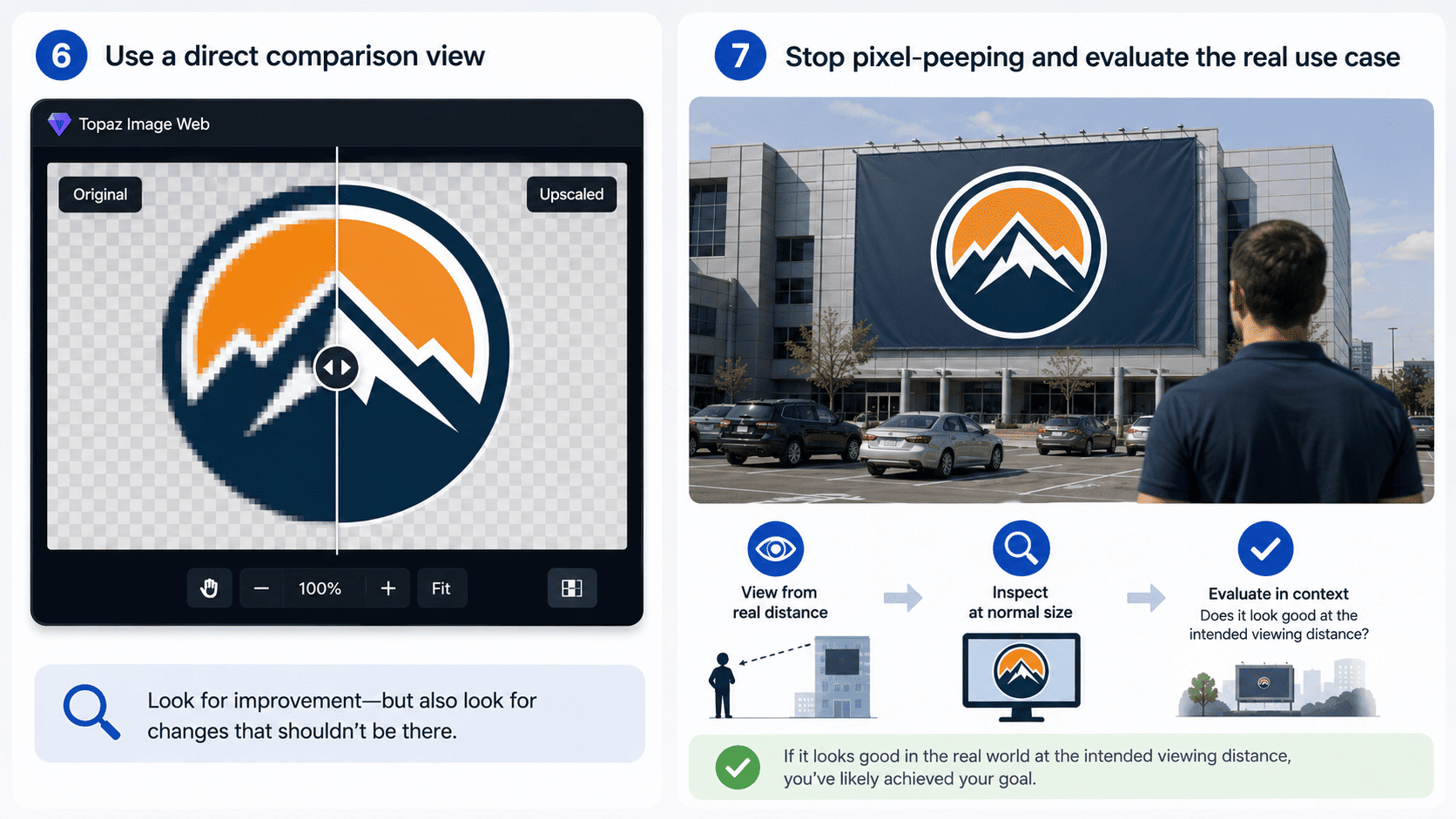
7. Evaluate at real viewing distance, not at 400% zoom:
A display isn’t normally viewed up close. Check whether any remaining flaws are actually visible from where people will see the finished piece. An artifact that’s only noticeable at the pixel level may not matter in the real world. But if the logo still looks off at its intended viewing distance, the upscale hasn’t solved the problem.
8. Download the strongest result, but don’t send it straight to production:
It still needs to be checked in the context of the final print layout.
What to Look for in a Before-and-After Comparison
A sharper-looking “after” image isn’t the same as a good result. For logo artwork, check these four things:
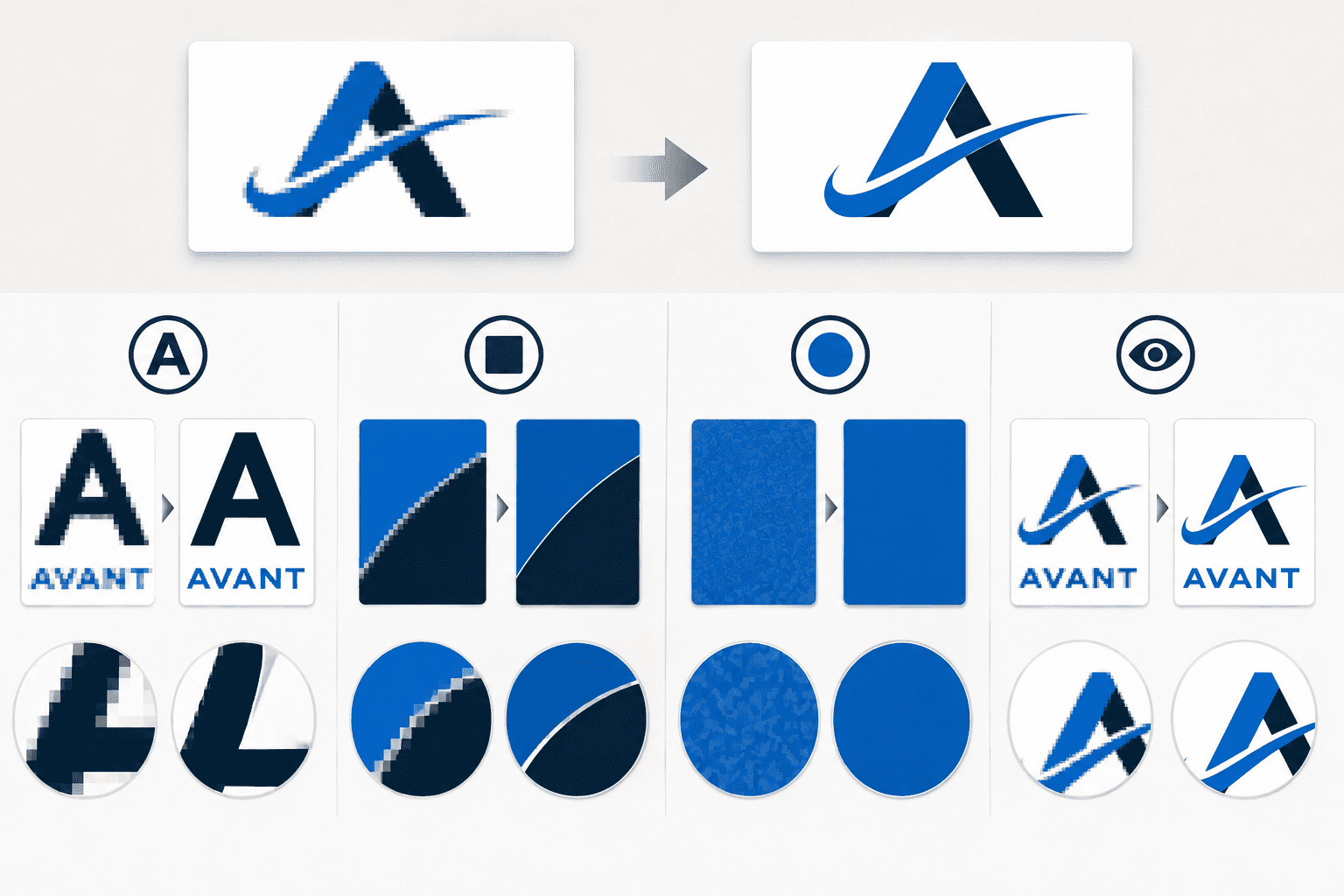
- Letterforms: Did the model preserve the shape of every character, especially curves, counters, thin strokes, small type, and trademark symbols?
- Hard edges: Look at the transition between flat colors for halos, new outlines, jagged edges, or smearing.
- Flat colors: A solid brand color should stay solid. Watch for mottling, unexpected texture, banding, or color contamination.
- Overall fidelity: Does it still look unmistakably like the original artwork? That matters more than whether the AI made the image look more “detailed.”
Is an Upscaled Logo as Good as a Vector Logo?
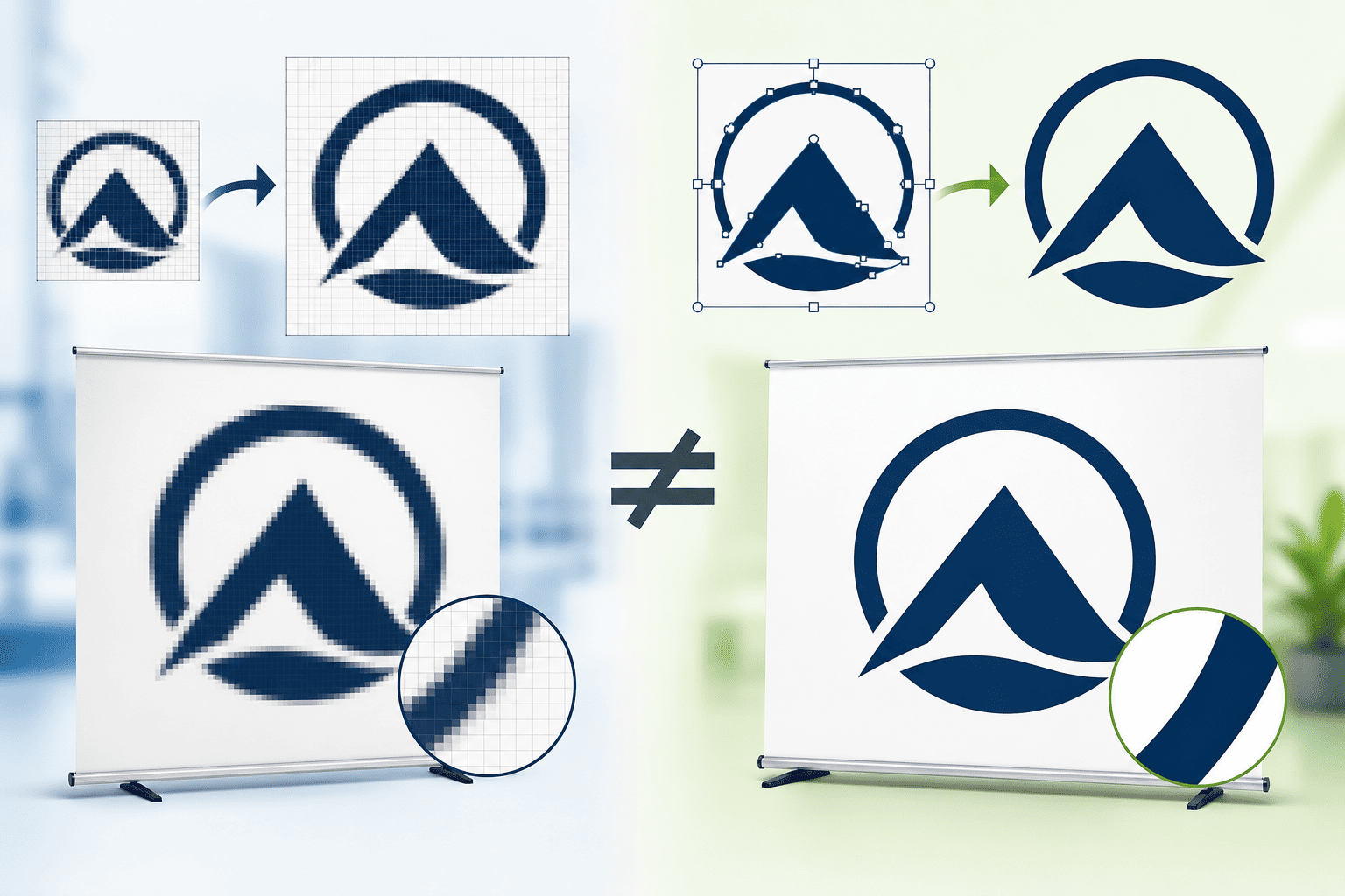
No. Upscaling increases the pixel dimensions of a raster image and improves how it looks at that larger size. Vector artwork describes shapes mathematically, so it can be scaled without a fixed pixel grid.
For logos, icons, and other clean brand graphics, the original vector file is the better option whenever it’s available. Think of AI upscaling as a rescue option, not a replacement for keeping your brand assets organized.
How to Make the Upscaled File Print-Ready
Upscaling improves an image, but it doesn’t automatically make it ready for production. After downloading a result:
- Check the final effective PPI by placing the image at actual finished dimensions in your layout software.
- Confirm the file format. It may not match what you originally uploaded.
- Review color handling. Topaz Image Web doesn’t offer documented CMYK output control, so treat color conversion as part of your layout and prepress process, not something the upscaler handles for you.
- Check the artwork at finished size, including logo proportions, edge quality, text, colors, QR codes, URLs, safe areas, and overall layout.
Then have the production file reviewed before it goes to print.
Not Sure If Your Logo Will Hold Up?
You don’t have to figure this out on your own. Send us your best available file along with the display you’re considering, the finished size, where it will be used, and the approximate viewing distance. We’ll tell you where you stand.
Sometimes an upscale is enough. Sometimes the file you already have will work as-is. And sometimes the better move is spending fifteen minutes tracking down the original vector artwork. That’s much better to know before your display goes into production.
Every Lush Banners order includes a free proof before production, and our artwork review process is built to catch these issues while they can still be fixed.